…otherwise known as “Conditional Formatting”
Often in a spreadsheet you want to highlight your numbers to emphasise their value.
So how do you make the magic happen?

With as little work as possible, so this is where Conditional Formatting can help…
1. Highlight Top/Bottom Values
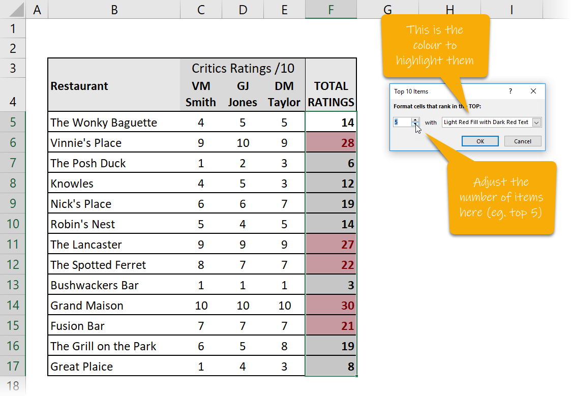
One really useful thing you can do is to automatically highlight the top 5 or bottom 5 values in a range. (In fact it can be top 10, 9, 8 or any number you choose).
You just highlight the numbers and then select Conditional Formatting – Top/Bottom Rules – Top 10 Items…
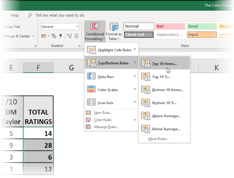
Then you can choose a colour to highlight them and whether it’s the top 10 or a different number you want to see, (i.e. top 5 values)…
Here’s short video showing you how to do it:
2. Highlight Cells Rules
Another useful Conditional Formatting option is to highlight cells that have values that are defined by a rule we specify.
Maybe I want to highlight all cells where the value is greater than 25, or less than 10 or between 10 and 20 and so on.
To do this, highlight some cells with values and select Conditional Formatting – Highlight Cells Rules…
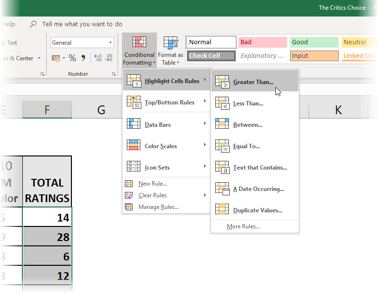
Then choose which rule you want to use, (in this case I’m choosing the “greater than” rule)…
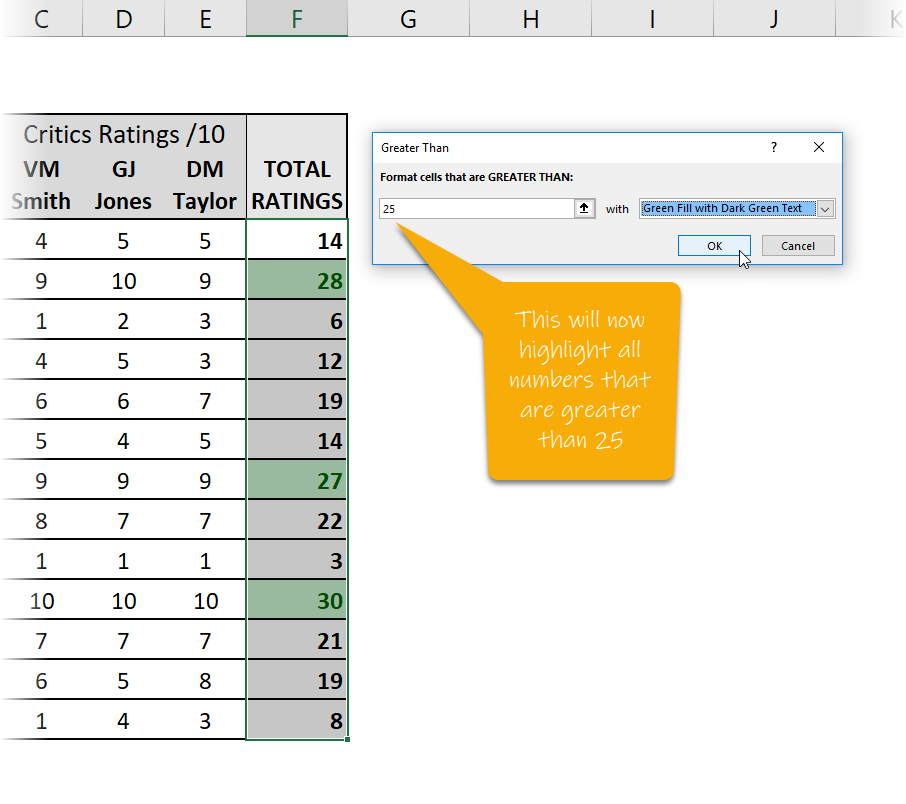
Then select the rule (in the case above highlighting all values that are greater than 25) along with what colour to make them.
Here’s a short video showing you how to do it…
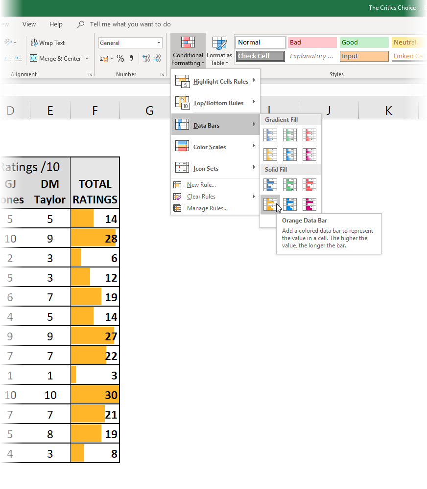
3. Data Bars
This is a really neat visual trick.
You can add some blocks of colour into your cells to show how big the values are as a visual extra.
To do this, just highlight the numbers you want to add Data Bars to, and select the command Conditional Formatting – Data Bars.
Then highlight the various colours to see the visual effect in action…
Here is a short video showing you how to do it…
4. Colour Scales
You can apply a gradient effect to cells with values to illustrate a sort of “heat map” that shows the smallest to the largest in terms of colour.
This might for instance, show the highest numbers as the greenest, through amber as the middle values down to reds for the lower numbers.
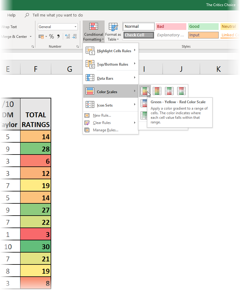
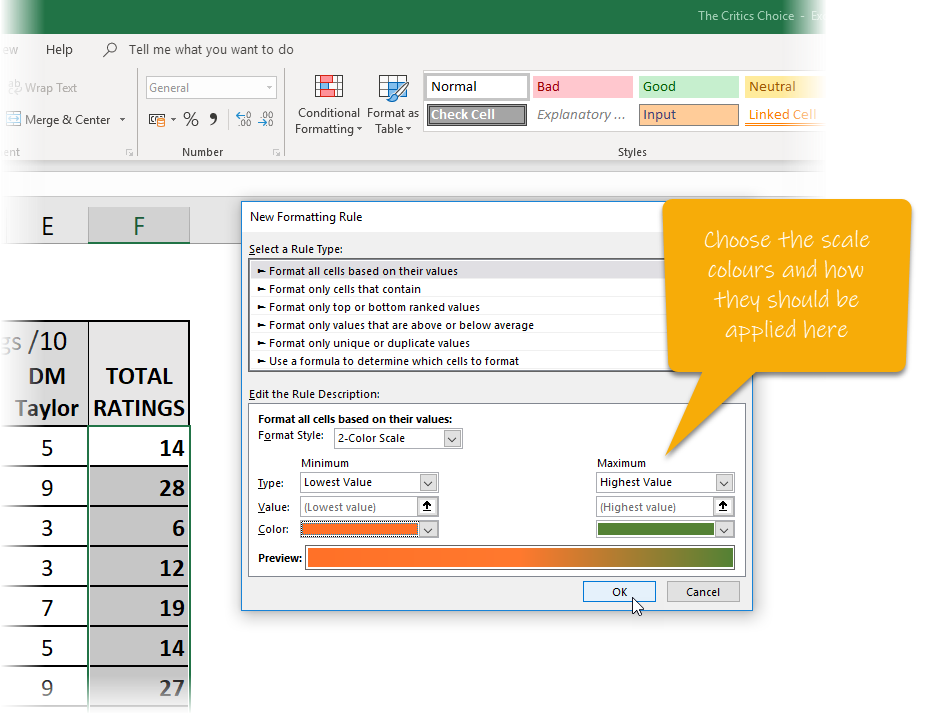
You define the scale yourself. Highlight the cells in question and then choose the command Conditional Formatting – Colour Scales – More Rules…
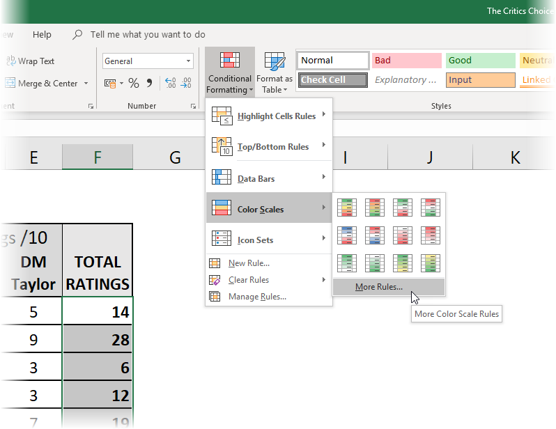
You then define the type of colour scale you want…
5. Icon Sets
You can also add in small graphical icons into the result cells themselves that display alongside the value to provide an even greater visual clue as to what is going on.
To do this, highlight some value cells and select the command Conditional Formatting – Icon Sets – More Rules…
Then just define your rule. In this case I want to show a green light next to restaurants that achieve a 25 or higher score, an amber light to those that fall into the 10 to 25 category and a red light for those that score less than 10.
It’s a great visual extra to the value itself…
Once you click OK, you see the icons appearing in the cells…
Here’s a short video showing how to do it…