
One of the recent additions to Excel has been the “Map” chart type.
It enables you to relate your data in your spreadsheet to geographical regions and this gives you a really good graphic that you can share with others.
But it’s not just a pretty chart type…
If you start with a simple list of countries in a spreadsheet, you can now convert them to “Geography” and they will be recognised as places…
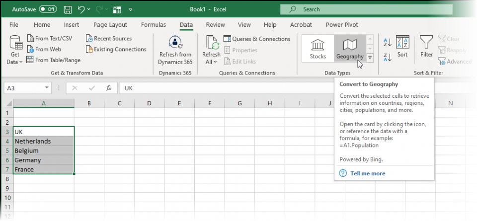
The command to use is Data – Geography…
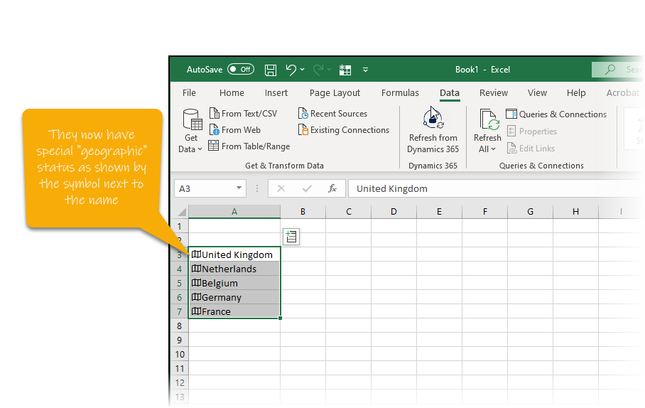
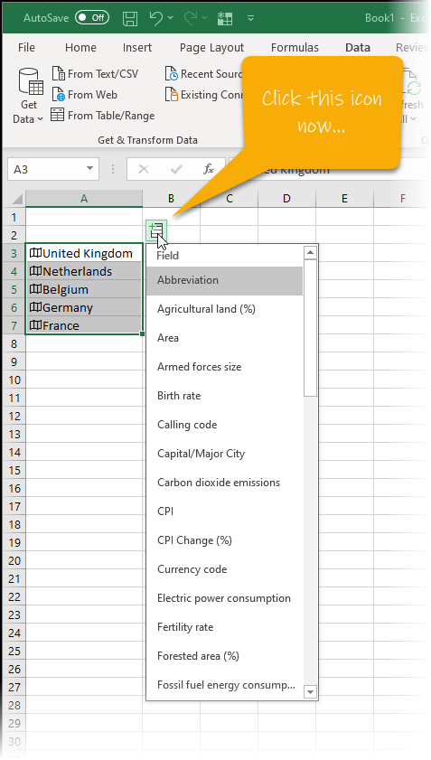
…and they are converted to “geographic” data and therefore you have access to a great menu of possible data that you can automatically add in to your spreadsheet columns next to the countries…
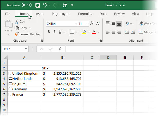
In the example below, I selected “GDP” from the menu and Excel has automatically entered this data and formatted it accordingly…
You then create a Map chart from this data and Excel knows whether or not from the ocuntries you have which map to show (i.e. World, or Europe, for example).
The video below shows how to use this functionally to create a map showing population statistics…